


LOCATION TYPE
Residential
Commercial
ARCHÉ
A 1978 Vancouver Special completely reimagined as a light-filled, playful family home. We changed the roofline, flipped the floor plan and added a few decidedly unexpected moves to turn an uninhabitable box into something with serious personality.
PALETTE
RED | OR | YEL | GRN | BLU
PNK | BRN | BLK | WHT

MATERIALS
Viola Onyx Slab | Brass | Blush Velvet | Red Oak | Metal Mesh
The
Challenge
Let's be honest: Vancouver Specials don't exactly have a reputation for being exciting.
Built in 1978, this boxy home had great bones and huge potential. Our clients—a sophisticated family with two young boys—wanted a vibrant, contemporary space packed with color and personality, far from a generic cookie-cutter house.
Unlocking that potential took resilience. Before construction even started, we spent over a year navigating the Board of Variance to resolve permit issues from an unpermitted past renovation and missing city records. Mid-build, COVID hit, driving material costs up by 30% and tangling supply chains.
Through constant budget recalibration and smart design edits on the fly, we protected the vision every step of the way—turning major bureaucratic and logisitical headaches into a distinct, character-filled family home.
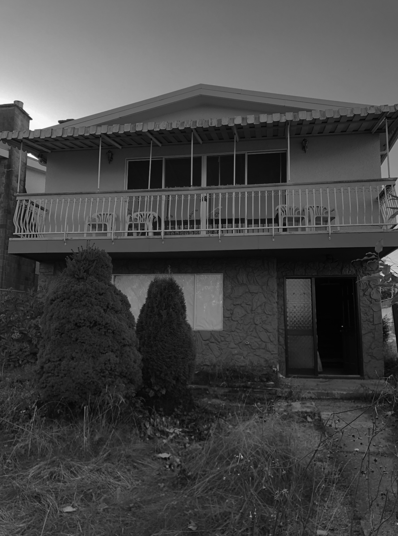
Built in 1978, this one had all the hallmarks of the typology—boxy proportions, a low-pitched roof and a pretty uninspiring interior. But underneath it all were great bones, an unusually generous footprint and a lot of potential. Our clients saw it too.
They were a sophisticated couple with two young boys who wanted a home that felt cool and contemporary but still fun enough for a family. They didn't want something generic, overly serious or designed to look like everyone else's house. They wanted colour, personality, architectural interest and plenty of room for their kids to actually be kids.
The house itself, however, needed some convincing.
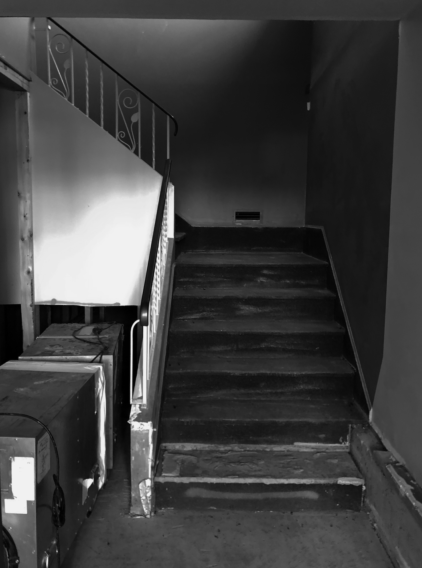
A previous renovation had been done without permits, leaving the home uninhabitable and creating a substantial amount of red tape before we could even get started. To make matters more complicated, the house had originally been built larger than the current allowable floor-space ratio for the lot—but the City had lost the original documentation approving the additional square footage.
So we had to prove it.
That meant more than a year navigating permits and the Board of Variance before we could move forward with the design we knew the house deserved. Once we finally got approval, we had another challenge to contend with: COVID.
Material costs increased by roughly 30% during construction, supply chains became unpredictable and the original budget had to be constantly recalibrated. We had to make some serious edits on the fly without allowing the house to lose its identity.
In other words, this project came with its fair share of headaches. Luckily, we like a challenge.
We approached Mink as more than a commercial interior. The goal was to create a fully immersive environment where the operational requirements of a busy beauty business were woven into something that felt closer to an art installation.
The
Process
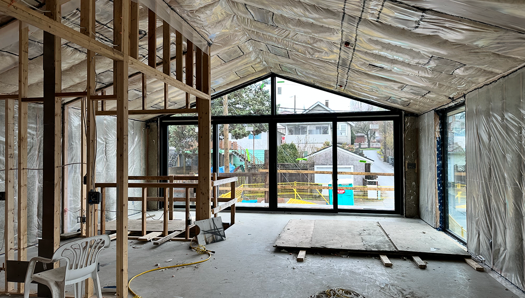
The first move was to get rid of the original flat roof.
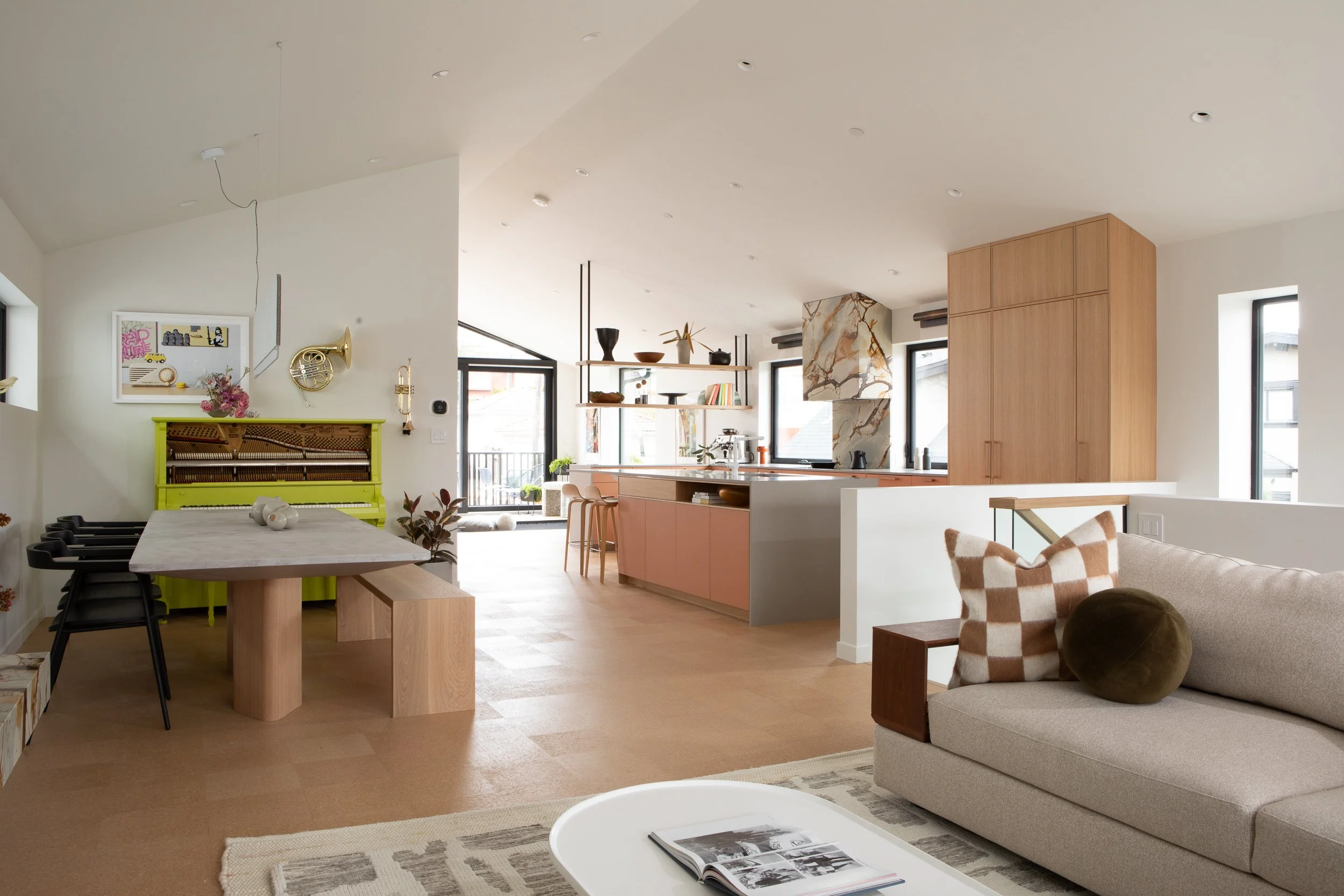
In its place, we introduced dramatically pitched scissor trusses that created 16-foot vaulted ceilings across the upper floor. It completely changed the game, bringing in more light, creating significantly more volume and giving us the opportunity to introduce a full wall of glazing at the back of the house.
We then flipped the floor plan. The kitchen, dining room, living room, office and powder room moved upstairs to take full advantage of the new vaulted ceiling and abundant natural light, while the three bedrooms, bathrooms, study and kids' play area stayed downstairs. This wasn't simply a matter of moving rooms around; the entire house was reorganized around how the family would actually live in it.
At the back of the house, we designed a floor-to-ceiling wall of glass with oversized sliding doors that opens the upper level directly onto the existing deck. Making that happen required serious engineering to support the new roof structure and withstand the significant wind exposure from the lane.
At the front corner, we pushed things even further. A large LVL structure allowed us to cantilever the corner of the house and install a seamless wraparound window. We met with more than 15 companies before finding one willing to take on the challenge. The result was worth the persistence: from inside, the window gives
We flipped the layout and introduced scissor trusses to create 16-foot vaulted upstairs ceilings, moving the main living spaces to the upper level to maximize natural light. A floor-to-ceiling glass wall opens directly onto the back deck, while a cantilevered corner features a seamless wraparound window framing views of the North Shore mountains.
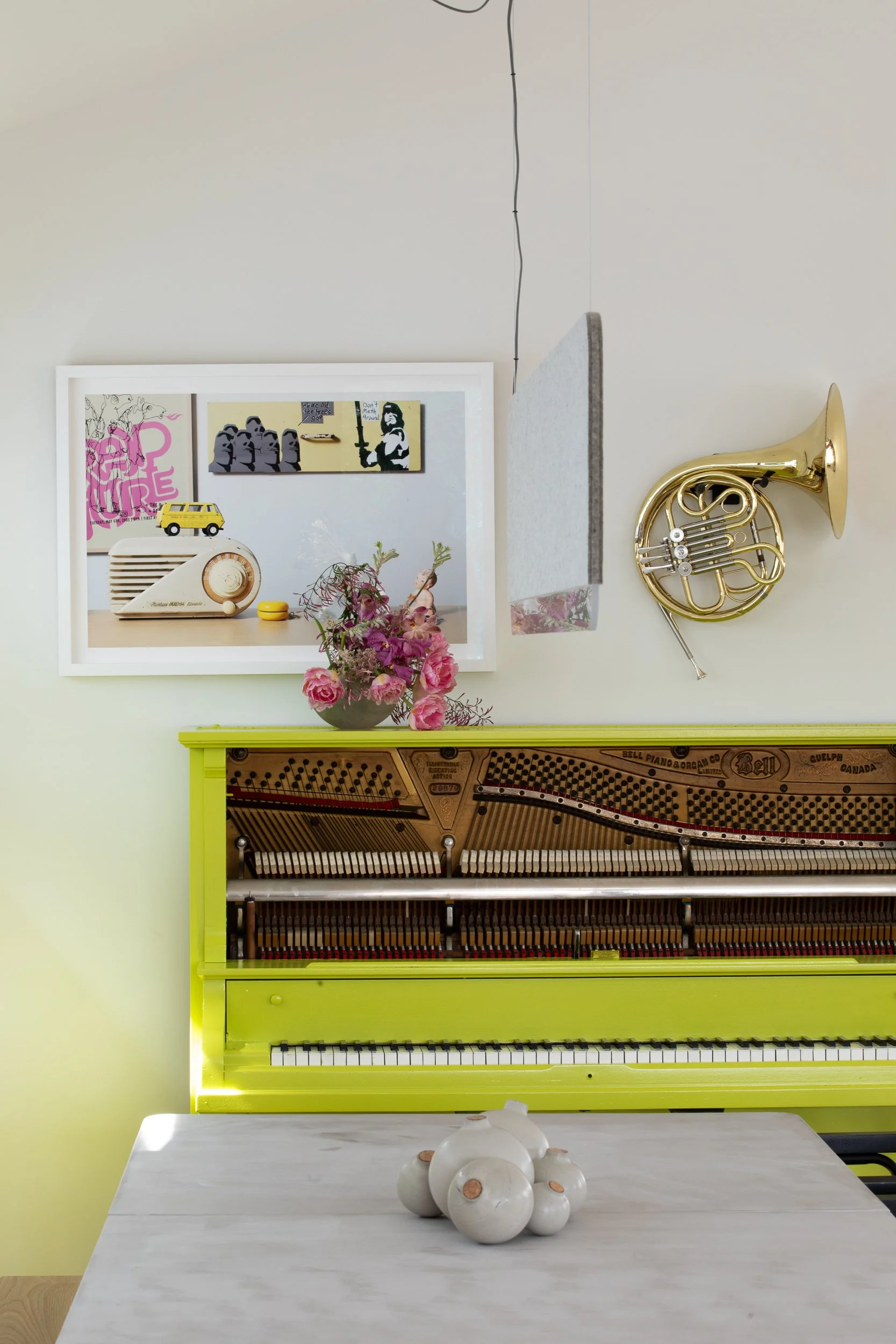
The interior embodies a "sophisti-quirk" concept—pairing clean architecture with playful, unexpected elements. Terracotta laminate and dramatic blue quartzite in the kitchen are anchored by a restored, bright citron vintage piano in the heart of the home.
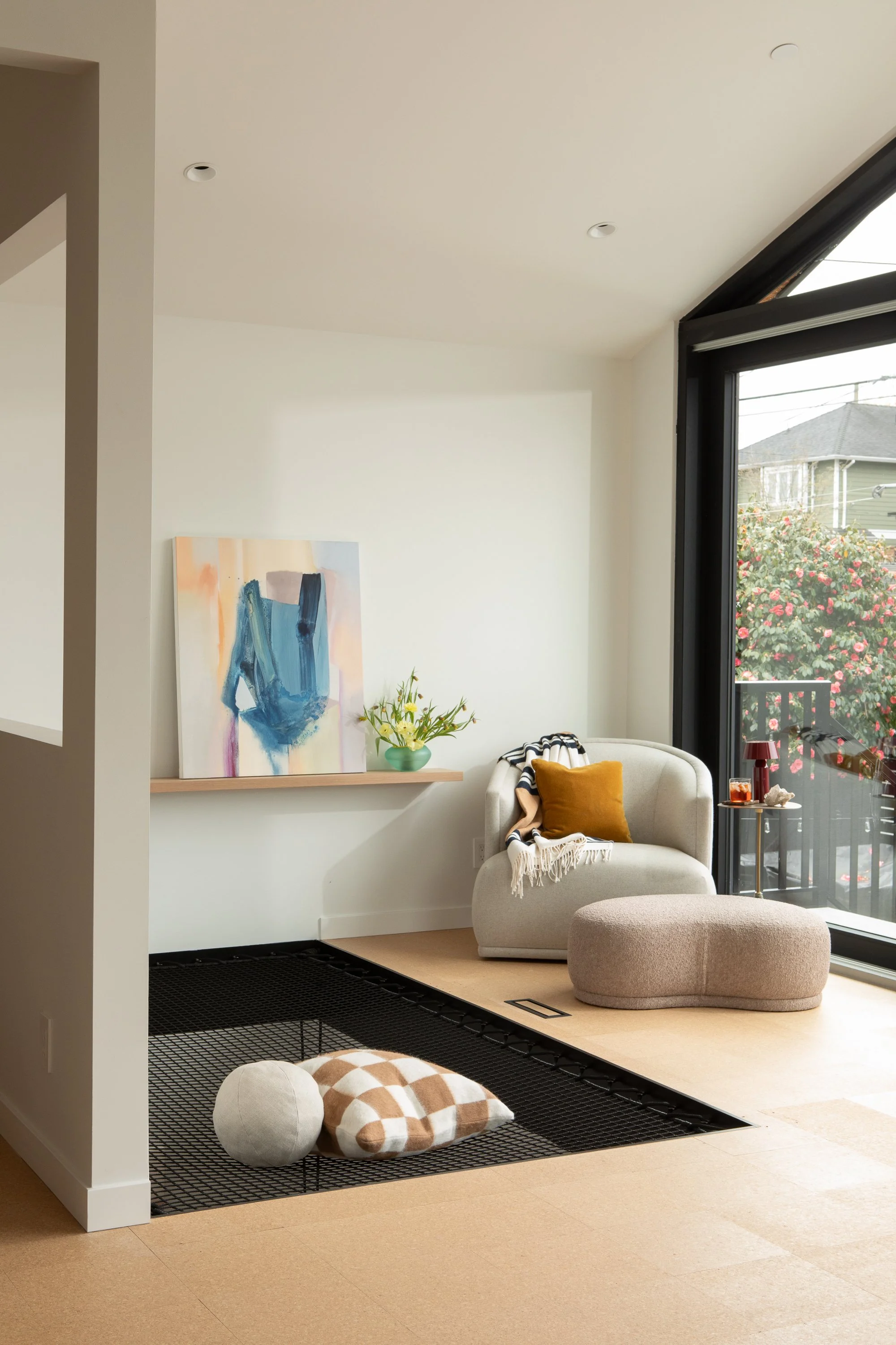
Connecting the levels, suspended netted platforms act as both light wells and indoor playgrounds, turning the space between floors into an unforgettable architectural statement.
the family uninterrupted views of the neighbourhood and North Shore mountains, while from the street it gives the home a beautifully clean, reflective quality.
The interior concept became what we called “sophisti-quirk.” Our clients were sophisticated but playful, and we wanted the house to feel the same way. The architecture is clean and considered, but then you turn a corner and something unexpected happens.
The kitchen is clad in a custom terracotta-coloured laminate that brings a surprisingly calm warmth to the space. Honed quartz keeps the surrounding surfaces quiet while dramatic blue quartzite wraps the hood and continues onto the sculptural island leg. Then there's the piano. We found and restored a vintage citron piano and let it become a full-blown colour moment in the heart of the home. It's bright, slightly ridiculous and completely perfect.
The most unconventional move happens between floors. We introduced suspended netted platforms that function as light wells, play spaces and visual connections between the levels. They're part architectural intervention, part playground and part conversation starter. Some guests immediately want to climb onto them; others absolutely do not. Either way, nobody forgets them.
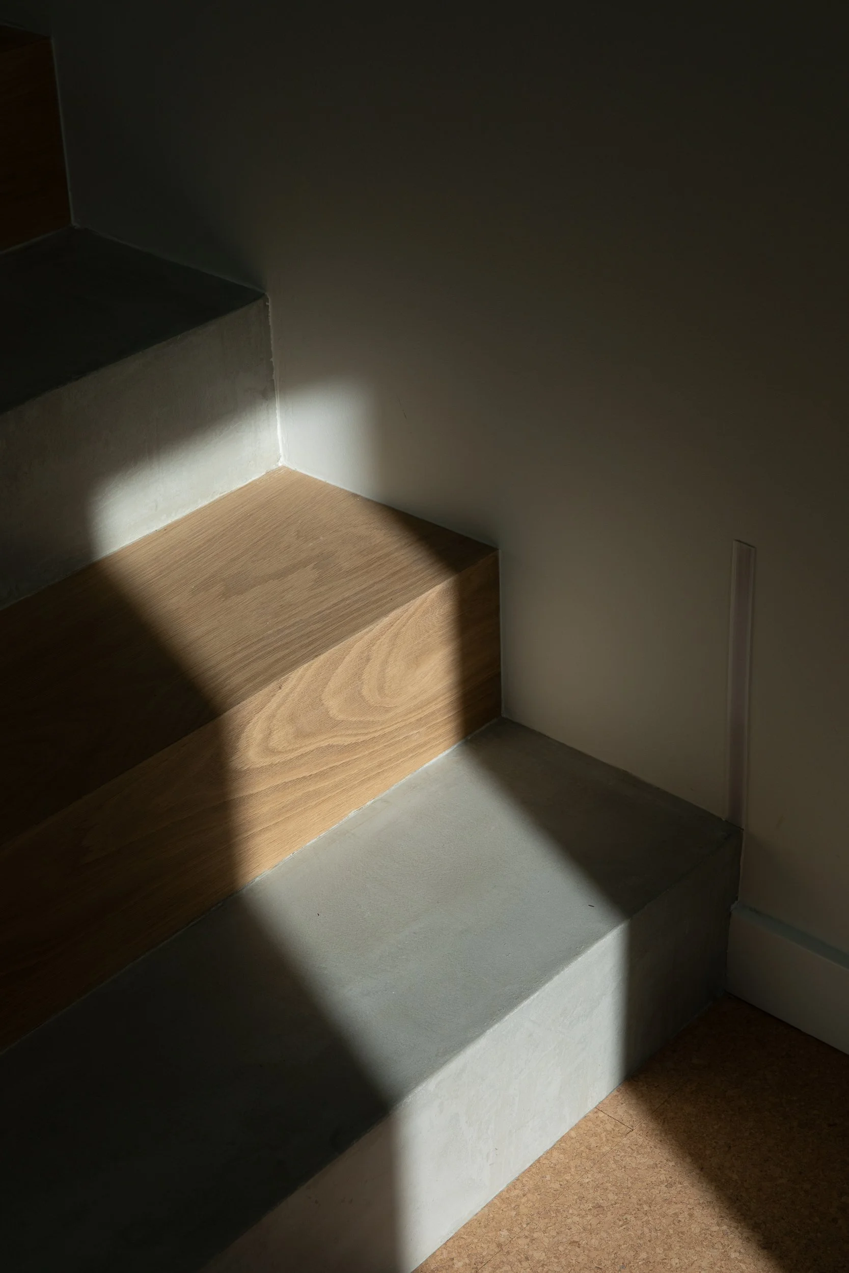
Underneath, cork flooring gives the kids a soft place to land and brings warmth to the lower level. It's also a particularly practical material for family life—comfortable underfoot, naturally insulating and far more forgiving than a hard floor when someone inevitably drops something.
Custom millwork was another major part of the transformation.
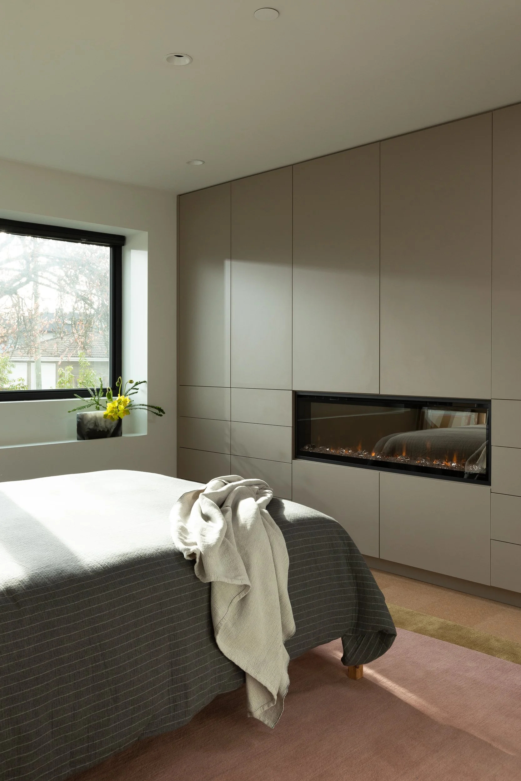
On the lower level, practical cork flooring offers soft warmth underfoot for family life. Custom millwork integrates seamlessly into the architecture to define circulation and storage, while salvaged Douglas fir framing was reincorporated throughout the build to honor the home's history.
The interior palette pairs Pacific Northwest staples—white oak, concrete, and natural stone—with bold pops of color so the space feels sophisticated, not beige. Outside, matte black stucco, shou sugi ban cedar, and hand-milled soffits with integrated lighting give the home a striking, contemporary West Coast presence.
Throughout the house, we designed and built cabinetry, storage and architectural elements specifically for the new floor plan rather than trying to make off-the-shelf pieces work around it. This allowed the millwork to become part of the architecture itself—defining circulation, creating storage and giving each room a clear sense of purpose.
We also made a conscious effort to reuse what we could. A significant amount of the original Douglas fir framing was salvaged and reincorporated into the rebuilt structure. It reduced waste, reduced the environmental impact of the renovation and allowed a piece of the original house to literally become part of its next life.
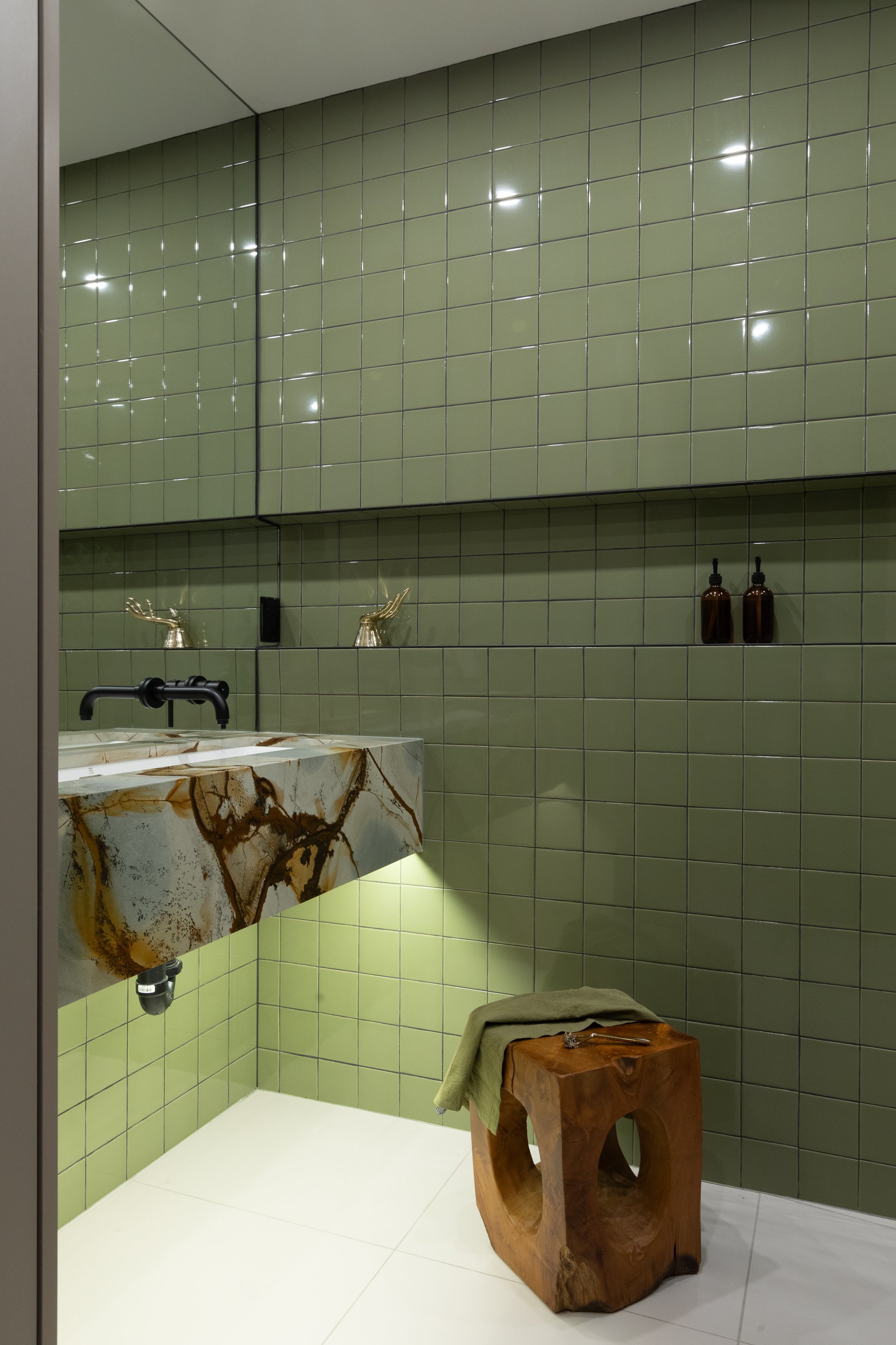
The rest of the material palette leans heavily into the Pacific Northwest: white oak, Douglas fir, cork, concrete, natural stone and ceramic tile. Then we interrupted all that restraint with carefully placed hits of colour. Because a house can be sophisticated without being beige.
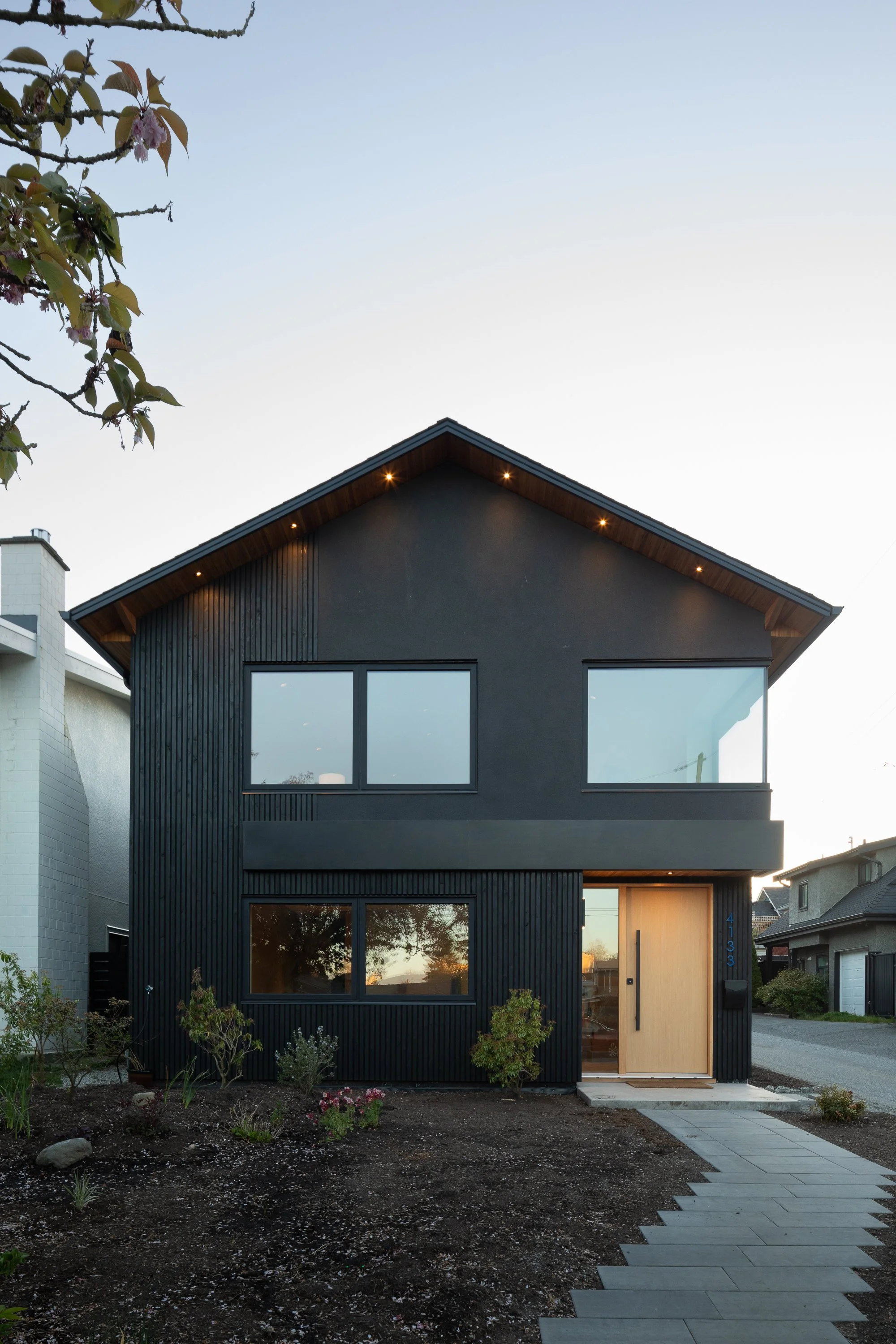
Outside, matte black stucco, shou sugi ban cedar and blackened hot-rolled steel give the home a strong monochromatic presence. Our team milled the solid cedar soffits by hand into narrow individual pieces, with integrated lighting washing the façade at night and emphasizing the shifts in texture. The result feels contemporary and distinctly West Coast—but not like it came straight out of a catalogue titled Pacific Northwest House.
The Solution
Archē is a pretty good argument for not judging a Vancouver Special by its cover.
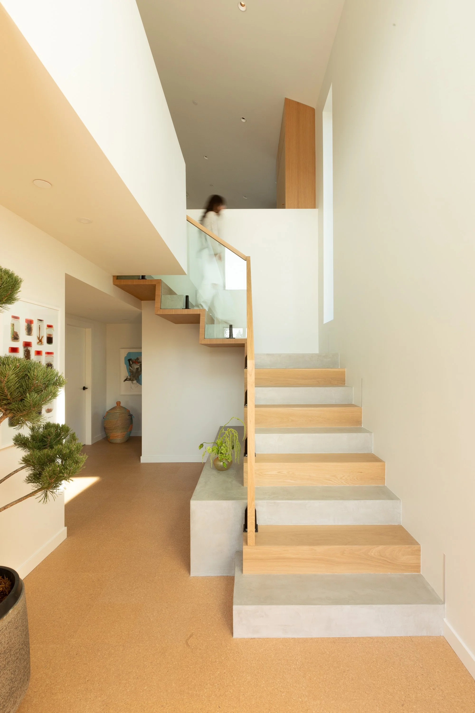
What started as a dated, uninhabitable house became a completely reworked family home with vaulted ceilings, expansive glazing, unexpected architectural interventions and a healthy dose of colour and personality. But the goal was never to make it flashy for the sake of being flashy. Every big move had a job.
What emerged is a home that feels architectural but comfortable, sophisticated but playful, and contemporary without being tied to a particular trend. It is very much a family home—just one with a little more personality than most.
We call that sophisti-quirk.

Explore Similar Spaces

COMMERCIAL | BEAUTY SPACE
Jun
A sculptural beauty destination in the heart of Yaletown, designed to blur the line between commercial space and immersive art installation.

COMMERCIAL | BEAUTY SPACE
Lash Room
A sculptural beauty destination in the heart of Yaletown, designed to blur the line between commercial space and immersive art installation.

